My front cover analysis is of Kerrang which is a British rock music magazine and was first published June 1981. It is called this because the word 'kerrang' is onomatopoeic and refers to the sound made when playing a power chord on an electric guitar which effects the music genre. It is also enigmatic which attracts a potential readers attention. This magazine focuses mostly on the punk rock genre.
Kerrang is published by Bauer Consumer Media which also publish the British magazine Q. Kerrang, like many other successful magazines, now have Kerrang radio, television, tour and awards which is a horizontal integration of institution expanding brand identity. Kerrang is sold at a reasonable price of £3.20 and it is published weekly. It has a circulation of 134,00. Kerrang has its own website which is very interactive as you can access Kerrang Radio and find information about the latest bands, get tickets for gigs and also subscribe to the magazine. You can also sign up for a weekly newsletter which gives you information on the latest magazine issue. This related to the target audience because many of their readers will most likely have access to the Internet and be up to date with technology.
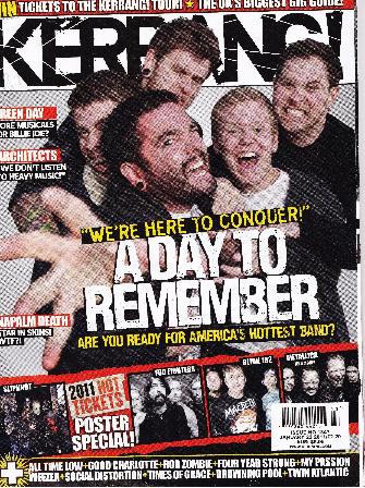
Kerrang's target audience is the ages of 14-20 which is quite a young audience. It also aims at more of a male audience which limits its circulation. I know this is the target audience by the artist choice, they use young or new artists like A Day To Remember, Green Day and Architects. These are popular rock artists and have also not just done rock music before which widens Kerrang's audience. In addition, these artist are all young and not old like Q magazine, showing the targeted age group as being younger.
The amount of text on the front cover is limited, this draws more attention to the images which are of famous, recognisable artists. The colours used in this magazine are red, black white and yellow. The rock genre can be very aggressive and the artists wear dark clothes as we can see on the cover. All these colours relate to the genre because the colour red connotes anger and aggression. Also the colours yellow and black are the signs used to show danger which also relates to the genre of rock. The masthead is at the top of the page behind the image. The initial purpose is to make it stand out which is done by the use of colour as the bold black typeface is against the white background. The main cover line also stand out by the use of size and colour, as it is white. Also it position in being right in the middle draws attention to it. The makes the magazine more eye-catching and vibrant, grabbing the attention of its target audience.
The main cover image is of the band 'A Day To Remember' and is employing a direct mode of address. The image is a medium shot to show all the members of the group. Their facial expressions are very crazy and fun which relates to the punk rock genre. Moreover, they look relaxed and comfortable with what they are doing making the read feel they will enjoy the magazine. The use of a direct mode of address draws the reader in as the artists are looking at the reader. One member also is holding there arm out as if to say “read this magazine”. They are all positioned near each other and close together implying they all have an equal role in the band and are good friends. They are all wearing black which helps keep the colours on the front cover minimal and no colours contrast. This helps make the magazine look more professional. In addition, they look like they are having fun and by pulling faces they are being fairly childish. This help the target audience interact with the magazine as there target audience is the younger generation. Also the fact it is male artists being immature can help target their male audience as they would be able to relate to it. The artists are in front of the masthead. The masthead grabs the readers attention first but then they will notice the picture and everything else on the front cover resulting in the entire page being seen.
There is a banner across the bottom in red with images of music artists who have a concert coming out and telling you that you can purchase tickets. This use of the banner makes it seem like there is even more in the magazine for you to read. It also says “Poster Special!” This use of punctuation makes it seem more exciting than it is and the word 'special' makes it seem like one off and can only get it in this magazine, enticing the potential reader. Having a banner on the magazine is a very conventional thing and it is something Kerrang put on all of their magazine covers. Also having a bar code near the bottom of the front cover. This keeps it out of the way and does not draw attention to itself but also at the same time makes it look professional.

The language is very informal and by having the main headline so large it gives the impression someone is shouting out at you. This help rock lovers interact with the magazine and also grabs the attention when it is on the shop shelf. Also at the bottom of the page there is a lot of puffs which are quite short however they give the reader a quick insight to additional features included in the magazine. The symbol '+' meaning 'plus' fascinates the reader as it makes them think that there is a lot to offer in this magazine and entices the reader. In addition, having a symbol instead of a word appeals more to a younger audience as they prefer images and can understand symbols and shortened words more. Abbreviated words are used on the front cover like “WTF!”. This is a common thing to say when talking to your friends on social networking sites,instant messaging or texting; all of these a more popular with the younger generation. The 'F' in this abbreviation is a rude and can be an offensive word which is why it is better abbreviated.
Colour is very important in this magazine as it uses the same colours throughout the magazine, red, black, white and yellow. This has formulated a sense of regularity and also so it can be recognised. I think the use of red and yellow it to take away the dullness and simplicity from having just black and white. Moreover, the colour red connotes danger and anger which can give us a clue to the genre of the band featured (Rock). The background is white which helps all the other typefaces and colours stand out more and not contrast, making everything more striking and eye-catching.
The presentation of this magazine is quite chaotic and things are diagonal and not straight however everything is clearly distributed giving it a good structure. The chaotic layout relates to the music genre because Rock is very loud and a lot of the artists shout. Also nothing is covering the main image and it all look very neat. This makes the magazine appear expensive looking and also very professional.
No comments:
Post a Comment