Tuesday 3 May 2011


Evaluation
Evaluation
Who would be the audience for your media product?
Th genre of my music magazine is pop and I am aiming it at females between the ages of 16-19. As my target audience is fairly broad it is a mainstream magazine. My secondary audience could be homosexual males as they may have the same interests.
I chose this target audience because I feel there are not really any pop magazines targeting 16-19 year olds. They only really focus at the younger generations, for example Top of the Pops target the ages of 10-13 and you can see this through the front cover through their use of colloquial language, bright & feminine colours and also its busy layout. The reason for this layout is because a younger audience would love the bright colours and lots of pictures.

The reason I chose females was because I feel the pop genre is mainly listened to by females. By doing this my magazine will have less competition, even though magazines like Top of the Pops are extremely successful they only focus the younger aged females, this will mean I will get more loyal customers who would stick to one magazine. I created a questionnaire and handed it out to 10 people, I found the majority of female 16-19 year olds I asked chose pop as their favourite genre. This helped me finalize my decision of my magazine genre. Furthermore it guaranteed my magazine would be successful as I know from my questionnaire what my target audience want. My magazie could appeal to people of ethnic minorities because my magazine includes artists who are from different ethnicities.
How did you attract/address your target audience?
It is important to attract my target audience if I want my magazine to be successful. If the wrong audience are reading my magazine they may get bored and may give the magazine a bad name. Firstly I carried out a questionnaire as part of my market research and found out what would appeal to my target audience and asked them to say why to give me a better idea of what to include in my product. I also used a lot of magazine conventions which would make the magazine conform to the typical style of a magazine. However because my target audience was a more mature age, I did not follow the typical busy layout of a pop magazine, and instead the layout of my magazine is much neater and more professional looking.
In what ways does your media product use, develop or challenge forms and conventions of real media products?
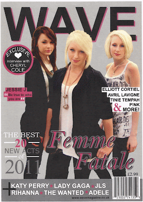
On the front cover the conventions I used were a masthead at the top of the page, cover lines, a main image, heading, strap line, an exclusive, banner and a barcode. All of these conventions make my magazine cover much more professional looking and give it a structure.
Firstly, the masthead is what I want to be noticed first and be recognised. To do this I made it very big, bold and a strong colour so it not only goes well with the colour scheme, but also stands out the most and grabs the attention of a potential reader.

I also situated it right at the top of the front cover taking up the whole upper area. It has nothing on the sides of it because I do not want to take the attention away from the masthead itself. By following this convention, my magazine will look more professional and of good quality. It will also make the magazine memorable and people will know what magazine it is just by looking at the top of the magazine.
As I wanted to keep my front cover looking organised, I did not want to add too many cover lines and make it look too chaotic so I just kept it to having one cover line on the right about artists but so it does not look boring, I added ‘& more!’ to entice potential readers and lure them in. Another way I lured the readers in was my having two banners, one right at the top of the magazine cover and one right at the bottom. The top banner was to make customers have a reason to buy this magazine rather than a competing magazine. It makes the customers feel like they are buying the best pop magazine they can. The typeface I used was also serif to make it look professional and of good quality. The word 'BEST' is a very good objective to make the magazine sound amazing and make the readers want to my it.

The second banner I used was to inform the reader of even more artists inside the magazine. This banner works effectively when luring a reader in as I put a plus sign on it making the reader think there are extra features and cover stories inside. I had a bit of trouble with this banner to begin with because I made it too big and it took up too much room which could have been used for different things. So to solve this problem I just got rid of one of the lines and kept it to one line and used a thin barcode.

I wanted to make the main image on the front cover very appealing thing as it is usually what a potential reader would then look at after the masthead. I used three girls that would appeal to the target audience. To do this I chose a band that had recently formed through a famous TV show, X-Factor, because most females wish they could sing and become famous. With the masthead being so strong and big, I placed the image in front of the masthead because all the cover lines and headings are over the top of the image, I did not want the image to seem like it had less importance and was too hidden. Another way of increasing its importance was by using a direct mode of address. This makes the fans/potential readers feel like they are looking and interacting with their fans, enticing them.
When I was creating my headline I knew straight away that it was going to be the name of the band however I had some difficulties with the positioning of the headline and also my strap line. I first had the headline quite near the bottom so it was not covering the upper area of the main image however when I had finished the majority of the front cover, it looked like there was too much unused space. So I moved the headline around a bit and then situated it a bit higher up. I also added a strap line which I think was a good idea because not only does it make the front cover look more professional, it makes the main feature, Femme Fatale, much more exciting.

Another convention I used to lure potential readers in was an 'exclusive' cover line. I put it in the form of a pug as a narrative device to gain the reader's attention making them want to read the magazine and feature. Also making the issue look more exciting because it seems like something exciting has been added to the magazine. To attract my target audience I used a famous pop singer, Cheryl Cole. The reason I chose Cheryl Cole is because the majority of her music fans are females and want to know about her life.
I also had a colour scheme which I used throughout my whole magazine and this was pink, white, grey and black. I felt this was the best colour scheme to use and it makes the magazine more mature and also attracts my target audience of females by the use of pink which connotes femininity.
The final few conventions I used on my magazine cover were the issue number, price and barcode. These make the magazine look professional, of high quality and worth buying because it is what is needed and expected to be seen on any magazine.
I used less conventions on my contents page however the conventions I did use, I used effectively. My contents page contrasts with a lot of other magazines as the heading is actually in the middle instead of right at the top. I did this because I only used one image so I want that image to be noticed. I think this worked well as even though the image is at the top, it still feels like the heading is at the beginning of where it should be; above the features. I kept the same colour scheme throughout making the magazine flow well and create a strong house style making my magazine look professional and of high quality. I had a few problems with the contents page such as choosing fonts and thinking of cover lines. I wanted to follow the same pattern of my pages being neat and not messy so I decided on using the font Times New Roman. I chose this because I felt it worked the best and looked professional. I also added a small sentence under a few of the cover lines to make it seem more interesting. I think by doing this, it makes the other cover lines more mysterious and the reader will want to find out about them as well.

On both my articles I placed the heading right at the top of the right hand-side page and then the main big image on the left. Underneath the heading I then had a strap line which was there to entice the reader and make them want to carry on to read the whole article. Then I had the article itself. I used this structure because when someone opens the page they tend to look at the image first, then go round to the heading and down through the article making it all flow very well. I also added other images to the articles to make them more interesting because people always like to look at images because it gives them more of an idea of what and who they are reading about. To make the Femme Fatale article seem more professional and realistic I added the tour dates for them at the bottom of the page because that it where it is usually found in music magazines. Another way I made my magazine look more professional was by putting page numbers at the top of both pages.
How does your media product represent particular social groups?
My music magazine is targeted at a female teenage demographic so I made the front cover, contents and articles organised and not chaotic because I did not want my magazine to be similar to the layout of rock magazines. Also the neat layout of magazines was what most people preferred when I compared the results of my questionnaire. I also used images of three girls who were described on the cover as "the success of Simons trio" showing they are well known pop artists whose target audience were also mature teenage females. The make-up on the girls were a lot like how you would wear it if you were going on a night out which is what 16-19 year old girls do. They are also wearing pink lipstick which compares with the colour scheme of the magazine and the target audience of females. The clothes they are wearing are very fashionable, even though my magazine is not a hybrid, what they wear is very important as it made them look more real and famous. They were also positively represented by smiling at the camera, this links to my genre of pop because the pop genre is a very upbeat genre unlike the aggressive representation that could be found in a rock magazine. My articles represent social groups well because for the Femme Fatale article I chose the story of them winning X-factor. 16-19 is the age group where you have a lot of free time and are a big part of X-factors audience so my audience would straight away know who the main feature of my magazine was. To represent the mature age group I did not use colloquial language however in the interview my song-writer answered how he wanted to. Even though it was not formal, it did not have any colloquial language in it. The problem I have with the main image on my front cover is the colour of their clothes. They are wearing dark colours which could mean my magazine could get mistaken for a rock magazine. I only represented white artists which could unintentionally exclude different ethnicities.
What kind of media institution might distribute your media product and why?
The type of media institution which might distribute my music magazine could be BBC as they distribute top of the pops which is also a pop magazine. Also as they haven’t targeted the age group I am targeting they would not lose out from their sales of Top of the Pops. Also BBC is a trusted business which would be helpful for my magazine as it would make it more successful. The problem I could have with using BBC to distribute it might be the fact it is very well known for its children’s channels which might make potential readers think it is not aimed at their ages group and maybe more the ages of 13-16.
What have you learnt about technologies from the process of constructing this product?
A lot of the technologies I used during the research and planning stage of my portfolio were computer and IT skills which I already had such as using search engines to find out information and using Word and Excel to construct my questionnaire and results. By having access to the internet and other facilities it helped me store my work much easier and get information a lot quicker than if i had to get it from a book. However, Photoshop was new to me and this was the first time I had used it. At first it was really hard to use but then I started getting used to it. A few problems I encountered were finding out how to edit or crop images. Furthermore the layers were very confusing and hard to understand at first. Another technology used was photography. Instead of using a phone camera I used a digital camera which made my images mcuh better quality and more professional. I also found it was much easier to edit on Photoshop. I also used an online blog which I used to keep a diary of all my work and the progress I made. I found this quite difficult as it felt like extra pressure when I was focusing more on my construction.
These are some of the things I did using Photoshop:
BEFORE AFTER

Firstly I cut out the image of the girls using the Quick Selection tool which I found fairly easy. I then used the rubber to smooth round the edges and get rid of any unwanted bits of the image which I may have missed when I used the quick selection tool. I then flipped the image horizontally because I was having trouble moving my cover lines around. Then to make the girls seem more ‘celebrity like’ I gave them a tan using the burn tool, darkened or lightened their hair using the brush tool and also changed the colours of their eyes using the brush tool. I conformed to the ideologies of women caring about their appearance by having dark eyes, fake eyelashes and tanned skin.
BEFORE AFTER

For this images I used the colour replacement tool and made the eyes bluer.

On the strap line I used two different effects which were outer glow and drop shadow. I used the same on the heading however I also used an inner shadow. I did this to draw attention to the strap line making the main feature seem more important.
BEFORE AFTER


BEFORE AFTER

In my article about Elliott Cortiel I blurred out the background and just kept it so I could see him using the blur tool, and I also flipped the image horizontally. I did this because it made the article fit in better however this is not what my final article looks like because I made a lot of changes.

BEFORE
AFTER
For this image I brightened it up for my contents page and also cropped it to make more room and make it look better quality.
Overall I used a lot of different techniques and effects on hotoshop to create idealistic representations for readers to aspire to. I feel this worked well and not only helped attract my target audience but also made my magazine look more professional.
Looking back at your preliminary task, what do you feel you have learnt in the progression from it to the full product?
I have definitely learnt how to have good time management as this is a key part of coursework during the completion of my portfolio. We were always set deadline and I did not want to have to rush at the last minute to do everything. I also learnt how to do a lot of things at once. I learnt how to keep my blog up to date as well as completing my construction and other things. Furthermore, I have learnt to be more organised and get things done as soon as possible. I think this is a good thing to do because even if you finish everything quickly, you can use the spare time wisely and improve on this and double check everything. I have also learnt how to use Photoshop now and use all the tools effectively and correctly. BY completeing my preliminary task I already had a good idea of how to use Photoshop which I feel helped me a lot and made me work much quicker on my actual construction of my magazine.
On reflection, how successful do you think your product is? Will it actually succeed if it was launched on the Market today?
I think my product is quite successful however there are things that could be improved if I had much more time. I feel I have targeted my audience well and the whole magazine goes together nicely due to the continuous colour scheme. I also think that after much market research, my magazine does have the capability to succeed. By completing my analyses of four different magazines, constructing my magazine became much easier as I had an idea of how to construct a music magazine using the right structure and layout. I also think my articles could be improved by using different language techniques which are more for my target audience such as colloquial language. Overall I think my magazine would be successful due to the front cover however the articles can be improved.
Wednesday 6 April 2011
Appendices - Appendix 3
Original Photos
Front Cover

This image was my second choice for my front cover.
Contents
First Double Page Spread Article
 This is the smaller image I used on my article.
 This image is the main image on my double page spread article.
Second Double Page Spread Article
 This was one of the main images on the article before I changed it.
 These were some of the smaller images on the article.


Front Cover

This is the main image I used for my front cover.

This image was my second choice for my front cover.
Contents
First Double Page Spread Article


Second Double Page Spread Article


Appendices - Appendix 2
Flat Plans
This is a draft of my first construction which I completed on Photoshop.
Front Cover


This is a draft of my first construction which I completed on Photoshop.
Front Cover

Contents Page

First Double Page Spread


Second Double Page Spread


Appendices - Appendix 1
Hand Drawn Drafts
Before I constructed my magazine on Photoshop I made hand drawn images. I did this so it would be easier for me to get started and give me an idea of what I wanted on my magazine and how I set it out.
Front Cover Hand Drawn Daft


Before I constructed my magazine on Photoshop I made hand drawn images. I did this so it would be easier for me to get started and give me an idea of what I wanted on my magazine and how I set it out.

Contents Page Hand Drawn Draft

First Double Page Spread


Second Double Page Spread

Friday 18 March 2011
Music Magazine Questionnaire Write-up
For part of my AS media I had to create a questionnaire based on music magazines to find out as much as I could about what people want to find in magazines and what they know about magazines. I asked 10 people of different sexes and ages to get a varied view.


The second question I asked was, What is your age? The main reason for asking this was to find out whether different age groups prefer certain genres or expect to find different things in magazines. The majority of people I asked were in the age range of 16-19 however a few were either under 15 or over the age of 23. I think it is good I asked a lot of teenagers as their view is most important to me because I am definitely targeting older teenagers.


I then asked a question based on the layout of magazines. It said, Which magazine layout do you prefer? I gave four choices so it was not too hard to choose but I made sure they were all very different so I could compare easily what people prefered. These were the magazine covers I used in my questionnaire:

Two people thought Vibe had the best layout, no one thought NME had the best layout, two people thought smash hits had the best layout and then six people decided Q had the best layout.

In conclusion, I think by doing a questionnaire about my magazine, it has helped me make some big deicisons. I have decided my colour scheme, my target audience, what to include in my magazine and also whether I would like to, in the future, create a website or not. The question which has helped me the most is my seventh question about magazine layouts. I have deicded to create a very neat and simple layout so my consumers do not get confused or feel they are buying a low quality magazine. Furthermore, as I am targeting older teenagers I would like my magazine to be more mature.
Subscribe to:
Posts (Atom)